Now, it has become difficult to imagine life without a smartphone in hand. Therefore, website optimization for different devices is almost the main point in the terms of reference for software development. And in this case, the Mobile First approach is already becoming the most advantageous solution. In this article, we will introduce this concept, the basic principles and its benefits.
What is mobile-first?
To understand why Mobile First came and became so popular, you need to turn to more "traditional" methods.
If you want to create a website, then you start by designing a layout for computers and laptops. They have high performance and can accommodate large amounts of content on a large screen. Further, the finished version is adapted for other devices, taking into account the capabilities of these devices. And what is the problem here?
The fact is, it is impossible to transfer all the visual and functional elements of desktop sites to the mobile version. Otherwise, you lose the ease of interaction that is so important in the mobile version. There are also problems such as long page loading, complicated navigation, inconvenient buttons, different site architecture, etc. And the designer was sitting, thinking, drawing, so that your site would have a unique concept. In other words, a small smartphone screen just bites off a big chunk of your initial idea and forces you to make compromises in functionality and visual solutions.
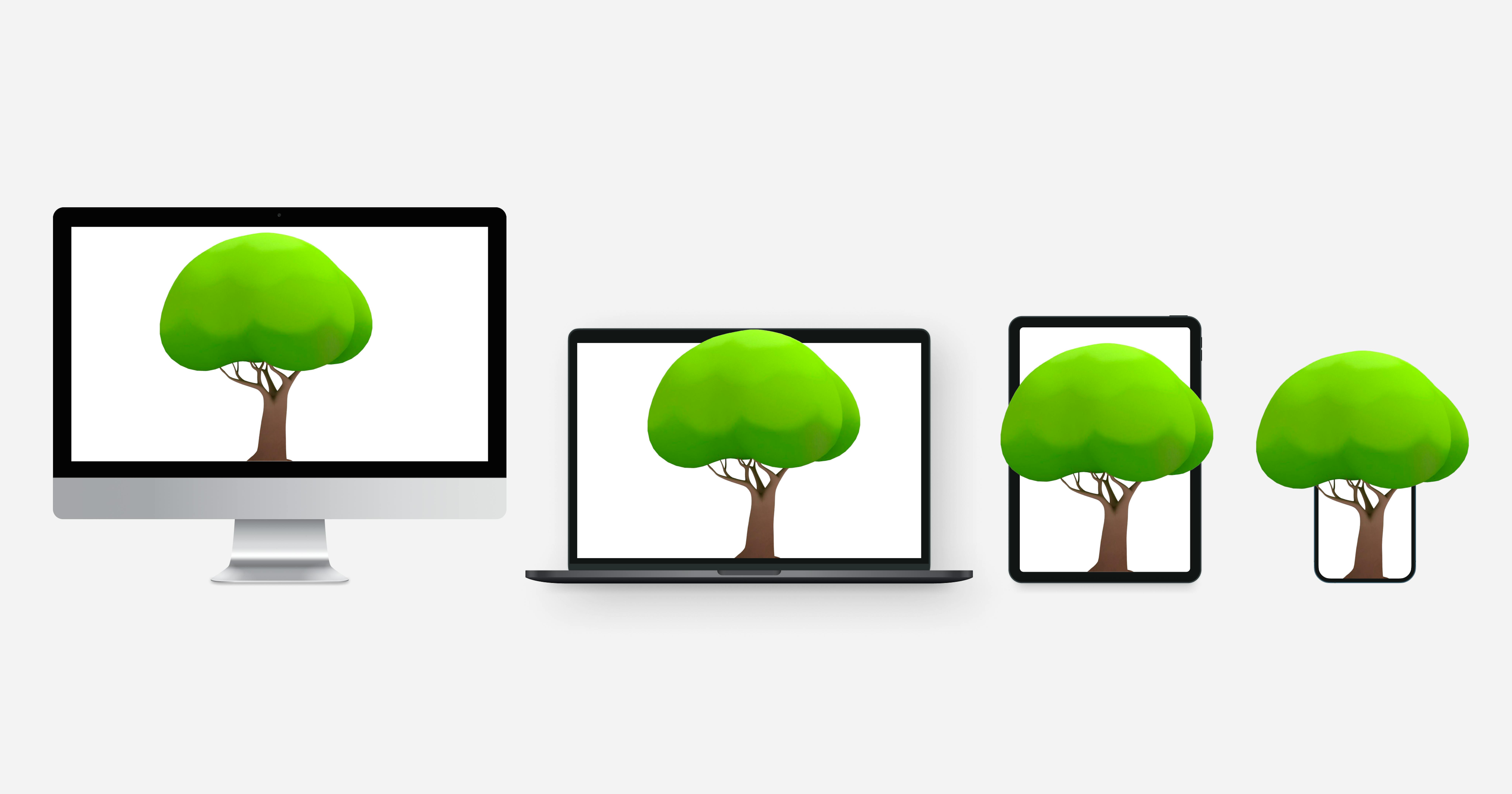
And at the root of Mobile First is the idea, just turn the optimization algorithm in the opposite direction. First, you develop a site interface that prioritizes mobile devices. And then move on to larger displays. If earlier it was thought that optimizing websites for phones was irrational, since smartphones mainly use applications and social networks, now the mobile market is becoming one of the main players. And this situation will only increase with the development and improvement of compact portable devices that can surpass PCs in their characteristics.
But it's important to mention here that there is a difference between Responsive/Adaptive design and Mobile First. Otherwise, it is easy to get confused about it. Let's take a look at this difference.
What's the difference between adaptive, responsive design, and mobile-first?
Adaptive web design (AWD)
For adaptive design, several statistical layouts are developed for different types of devices. And this takes into account the characteristics - screen width (320, 480, 768, 960, 1600 pixels), viewing area, touch control, the ability to rotate devices, etc.
Therefore, the scripts take into account the user's screen sizes and load the appropriate template based on them.
Responsive web design (RWD)
Responsive design is based on the idea of creating one flexible layout that adjusts to absolutely any screen width. The content is automatically resized. And it works the same for all devices with movable grid, flexible imagery, and media queries.
This path is convenient because you are developing one version of the site. But it does require careful validation to ensure that all elements display correctly in various sizes.
Mobile-first design
Here we have a completely different picture. First, a mobile version with a small screen is being developed. Then this version is adapted for computers, laptops, tablets. And developers can add additional parameters along the way. As a result, you get a correctly displayed version of the site that can be viewed from different devices. The foundation must be strong and always needs to be content. So, the basic principle of the mobile-first design helps in emphasizing content over navigation.
And it has great advantages for your business.
Why do you need mobile-first design
Among all the reasons, it is worth highlighting 3 main ones, which will definitely resonate for any business:
User-friendliness
A positive product experience across all devices is bound to result in consistently increased conversions and customer retention. And this, as everyone knows, is the main concern of every company. If a website is not optimized for mobile devices, then there is a high risk that users will visit it less often, even if they like the product or content.
Therefore, the UX of a website for mobile devices, or rather for small screens, must be thought out to the smallest detail. Avoid using small fonts, low-quality or cropped images, or poorly scaled pages. And Mobile-first helps a lot with this.
Fast loading pages
Pages that are immediately mobile-optimized load faster than responsive pages. The ease of the site, designed according to the principle of Mobile First, is provided by:
- posting only the most important content;
- use of images without loss of quality, but smaller size;
- the absence of cumbersome code, which is obtained by resizing the site elements using CSS and a lot of media queries;
- elimination of possible "crutches" that programmers can use for adaptation.
Search engine ranking priority
Google set the vector of website design towards mobile-friendly back in 2016. The search engine giant made one of the biggest announcements - mobile-first indexing would become the default for ranking websites. This means that Google smartphone bot would crawl the website first and use analyze the mobile-friendly content to index the web pages, structured data, snippets, and all other things.
There is a way when you can diagnose the adaptive version of the site for compliance with the Mobile-First Index algorithm.
Sites created on the Mobile First principle do not need such checks and are given a certain priority by default. And since such resources are distinguished by high page loading speed, this adds points to them in SEO promotion.
So, now that you know the reasons to choose Mobile-first design, it's time to explain how to do it.
Features of designing sites for mobile devices
Focus on content
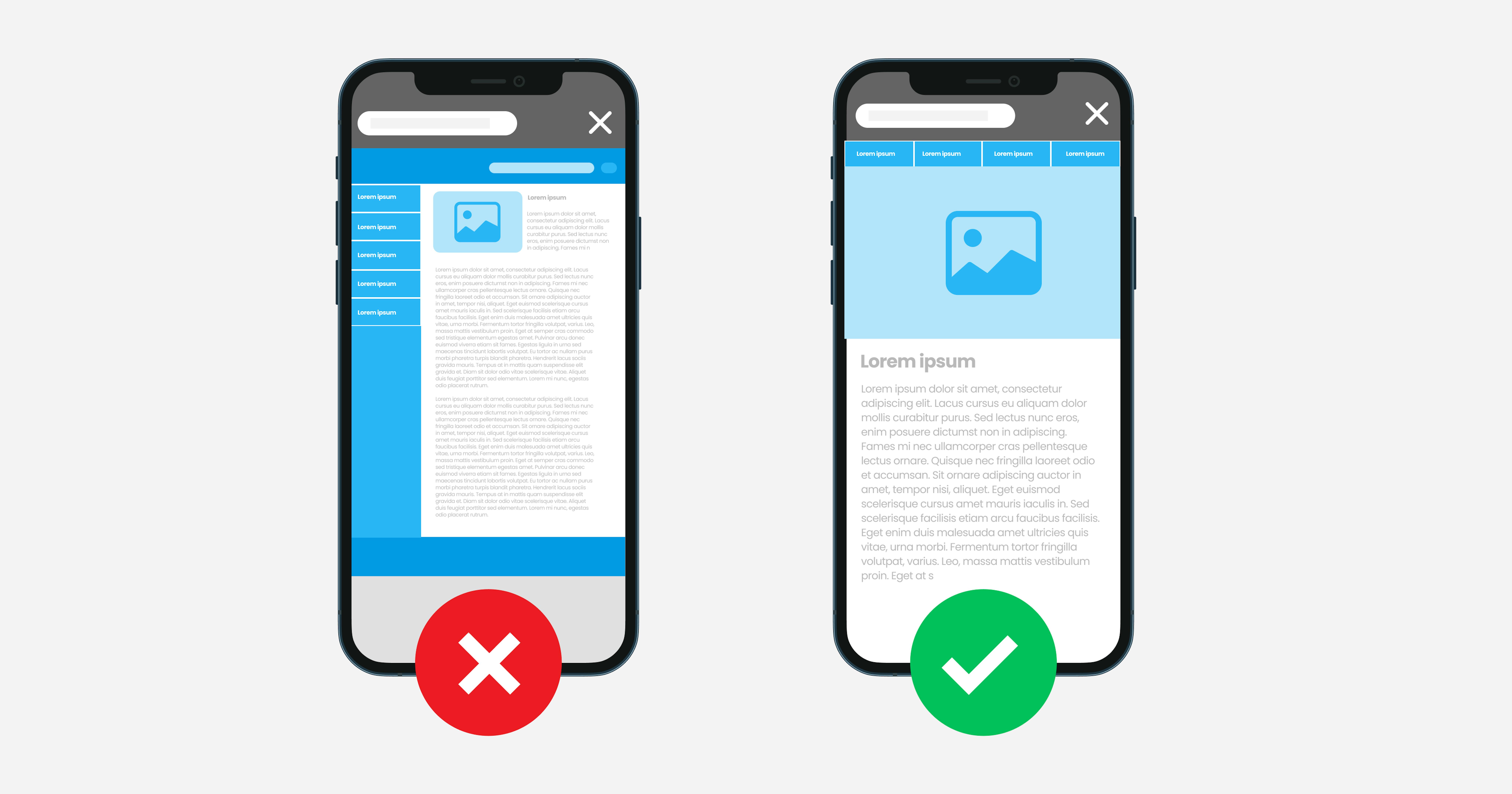
As we emphasized earlier, in this kind of design, content comes first. When designing on a small screen, you focus on the essentials and remove unnecessary elements. The behavior of users behind the computer screen and with the phone screen is different. Desktop versions often have additional features, pop-ups and white space. In mobile design, users need to easily see and read content. This means easy navigation, intuitive UI and high quality images.
Visual content hierarchy
You can improve user interaction with your site if you know not only what to show, but also how to show it. The visual hierarchy of content involves highlighting its most important components and placing them in the special areas of attention of smartphone users. In this case, designers can use psychological techniques to focus the site visitor's attention on the necessary elements.On the desktop, there is a wide horizontal field for visualizing content: you can use multiple columns, design spectacular showcases, and layouts. On mobile devices, where the screen is significantly narrower, the main action when viewing pages is scrolling up and down. The best option for displaying content is 1-2 columns, and if you need to arrange elements horizontally, provide them with a simple swipe with one finger.
You can stick to the "rule of the thumb". This approach is based on research on how users hold a smartphone in their hand and how they operate it.
There are areas that are difficult to reach with one hand. Important and clickable content should not be placed there.
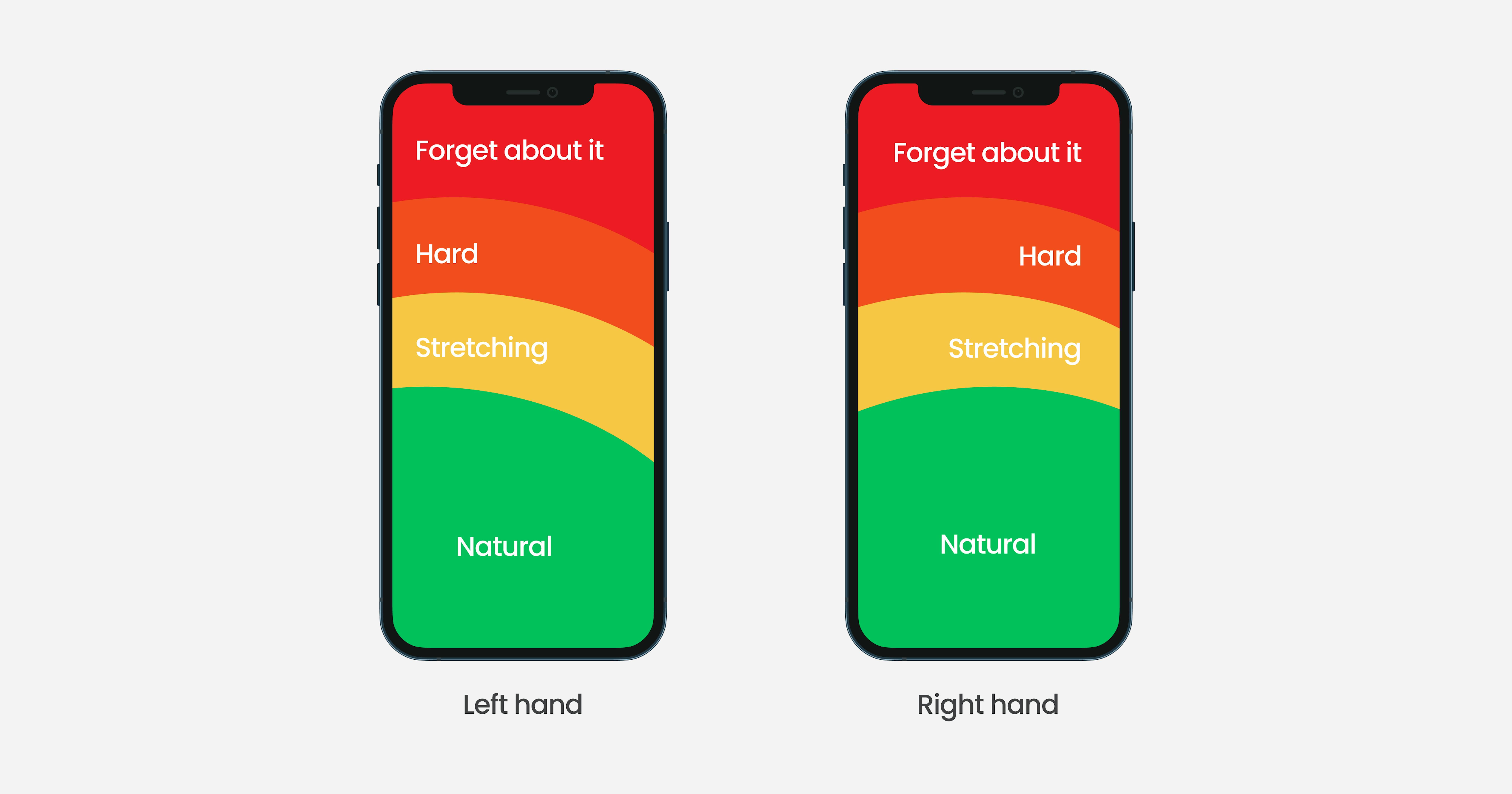
Good navigation on a mobile site is a demanding thing. It should both provide an ideal user journey through the resource, and at the same time be placed in compact interface elements so as not to distract from the main content. The goal of Mobile First Design is to place the right buttons, features, and CTAs exactly where they are needed.
Today, more and more often you can find menus with main items at the bottom of the page. The previous trend was a hamburger menu when you click on the icon, a list of available sections of the site opens.
However, you have to study your audience well and conduct a series test to give preference to any mobile navigation template.
User-friendly interface
Caring for the user experience while surfing the site is another mandatory attribute of the Mobile First concept. When designing an interface for mobile, it is necessary to take into account not only the limited display space but also other features of using a smartphone, for example, control via a touch screen. This means that it is necessary to exclude the possibility of clicking the wrong link or button.
It is also worth mentioning the unique features in mobile design that can improve the user experience. Here are some of them:
- Using the camera – You can upload the images you want or take an instant photo, and the camera can also help in reading QR codes. This already gives 100 points in favor of the user experience.
- Autocomplete fields – The function of automatically entering stored information can help users not to enter their details every time to register or purchase.
- Biometric verification – This can be a controversial feature, but it certainly remains very convenient. Face recognition or fingerprint recognition used to be in the plots of films or books, but today it has become a reality. It is a sin to miss the opportunity and not give your user a choice to use this function or not.
- Fast connection – Compared to the desktop version, mobile has a big advantage associated with contact information. With one click, you can go to the desired messenger, social network, mail, or directly contact the contact manager.
Over to you
The COVID-19 pandemic has already significantly changed our world and taught businesses to adapt to new realities. Lockdowns have changed buying behavior. A smartphone is a personal assistant that is always at hand. Mobile Internet makes it easy to find the information you need or make a purchase anytime, anywhere. Don't miss out on opportunities to increase conversion rates and customer loyalty – carefully design your mobile site. And Mobile First is suitable for companies that rely on the modern fast pace of life.

