Analyze with AI
Get AI-powered insights from this Mad Devs article:
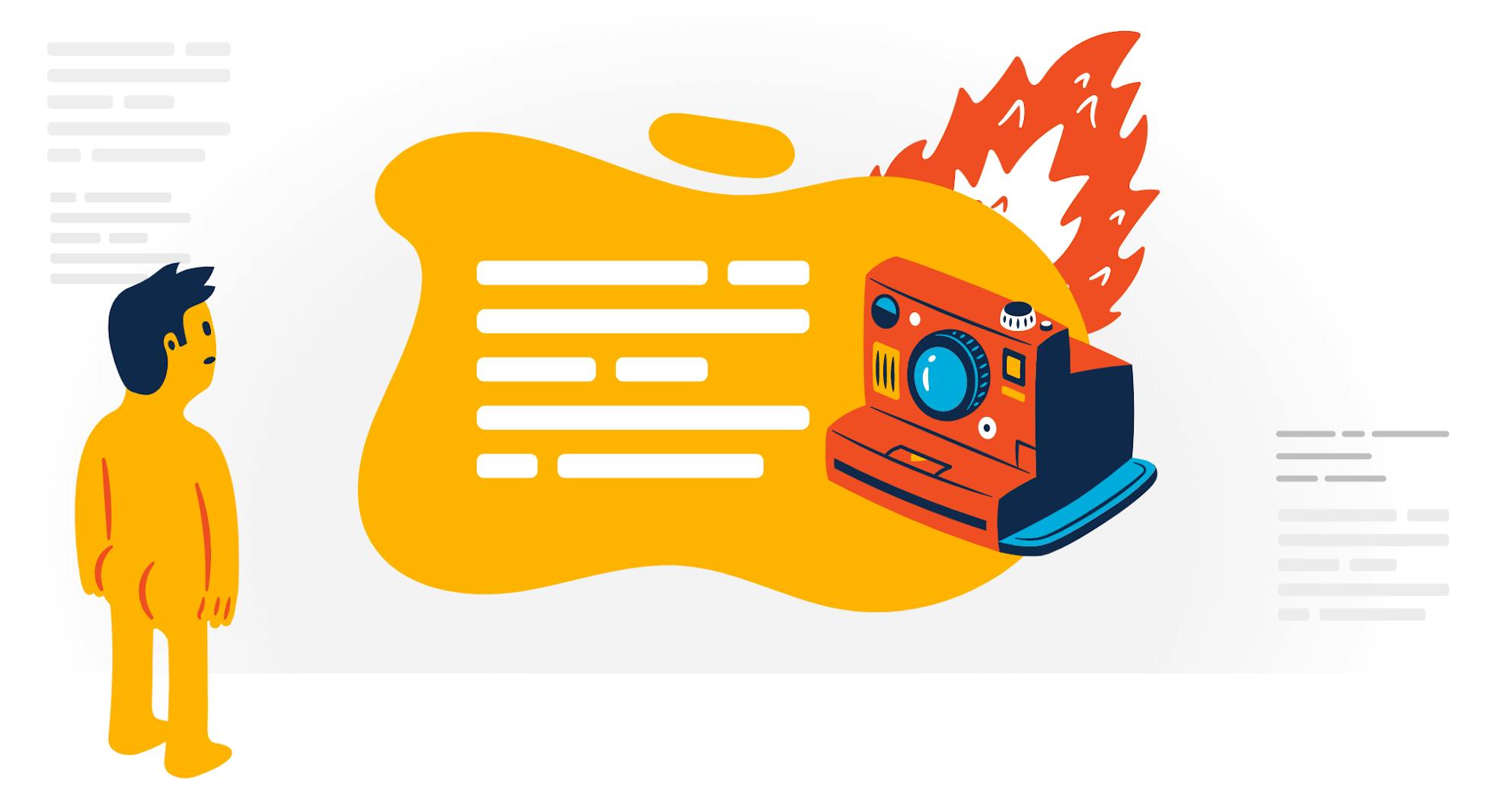
How often do you think a photo or picture could replace several paragraphs in a long post or article? Wouldn't it be better to take a look at them rather than pick information by pieces?
Every time I go through a long read, I have this feeling. It's hard to mentally visualize what the text says. For example: "There were about 1,000 people protesting!" What "1,000 people" really mean in this case? Is it a large crowd or not? Can they walk peacefully along the square without taking up the roadway? Or are they creating a traffic jam by crowding the road? It's not clear.
Let's consider any mass or social media where the text is the primary means of informing people. Texts are carefully polished by editors and copywriters and eventually approved by the business. Even in this case, there are several problems: the reader cannot see the high-level picture. Misconceptions are always the case, and they have nothing to do with reality. Text information lacking graphics is hard to memorize. Let's have a closer look at this last point.
Excursion into design history

Before the rise of the Internet, books, newspapers, and magazines were the only sources of information. Advertising on street posters could also inform people about a new product, service, or event. And the more interesting the news was designed, the more engaging it was. Publishers competed with each other for readers, trying to please them and structure information in the whole new ways.
By 1900, the major newspapers had become profitable engines of advocacy, Meticulous and sensational, along with serious, and the purpose of gathering news. In the early 20th century, before the rise of television, an average American used to read several newspapers a day. Readers had more information than they could digest. Striving to survive in the competition, editorial offices had to look for ways to attract and retain readers. One of those ways was design. Newspapers and magazines abandoned the standard look & feel with at least three columns of solid text per page. They started to combine the text with photographs and illustrations splitting it into readable blocks.
Let's go back to the 21st century. A lot of information is transmitted through the Internet, but the trend to improve the way your texts are designed persists.
What is it for?

Visual information is remembered and reproduced by humans faster. This phenomenon is called the picture superiority effect. In 72 hours after reading a text without pictures, a person remembers only 10% of the information. For illustrated text, this metric increases up to 60% of the information. Statistics also speak in favor of design: using images in addition to text increases the number of views by 120% as researchers say.
When did the first illustrations for texts appear?
In ancient Egypt, scribes used images to illustrate their texts. Without those illustrations, we would hardly know what the Egyptians looked like back then. It would have been difficult for the ancient Egyptians to imagine what their deities looked like if their holy manuscripts didn't contain any illustrations.
Nowadays, the main task of the illustration is still the same—it is to visualize what the text says.
What is the best way to match the design and the text?

The answer is obvious: the simpler, the better. The reader should understand what is in the picture at a glance.
You should not strain the reader with complex visual abstractions or metaphors. The illustrations overloaded with text also look ridiculous. Color combinations that look good to a human eye are best. Working on an illustration, it is important to stay focused on the main message and skip unnecessary details. This applies to the cover of the post, and the illustrations inside it. Easy-to-understand infographics might be a good solution for complicated technical articles.
There are many design options, the main thing is to focus on the core message of the text.
If it is:
- Warning about something, it is best to show illustrations and photos in dark shades with great contrast. You can emphasize emotions and hyperbolize details in this case. Caricatures or semi-abstract designs are also appropriate.
- Informative, the best way to illustrate it is to pull out the quantitative metrics — percentages, volumes, etc. Various lists—for example, requirements and recommendations — can also be visualized well with infographics. You should not choose rich and contrasting colors, it is best to combine informative texts with pastel colors.
- Solemn, then you should use as much emotion and color as possible. You can bring more dynamics to your illustrations by employing a symbol or gesture demonstrating happiness or joy. Bright and eye-catching colors are also worth using.
Illustrations can fill the text with emotions, help the reader look at the problem from multiple angles, provide a visual comparison, and add value in many other ways. Basically, they help people to understand the text and save time.
Useful links
What if you do not have an in-house designer or illustrator? Let's say you have your own blog and need covers for articles and illustrations. The Internet offers a number of free online services where you can create decent graphics by yourself.

Let me give you some examples:
Icons8. Here you can find ready-made graphic elements of different styles. The site is intuitive and friendly to the user. It is possible to add your images in different formats, or custom text. The image file can be exported in high resolution for free (exporting in SVG format is also available, but you will need a subscription to use this option).
Artboard.studio is an excellent resource for everyone seeking good banners and covers. It is especially good for app owners interested in mock-ups (photos of devices with your app). Artboard.studio offers a large number of free objects that you can use for custom illustrations.
Canva is a service aimed at creating designs for social networks, presentations, and even printed matter. The service offers ready-made templates and graphic elements, as well as tools for editing them.
Freepik is a huge stock of free illustrations, mock-ups, and photos that can be downloaded and edited. However, to use it, you will need the skills of working with the graphics editor like Adobe Photoshop or Adobe Illustrator.
Unsplash is a great source of free pictures. This is an excellent service with lots of photos contributed by photographers from many countries of the world. People provide their photos on Unsplash enabling others to use them as needed (do not forget to thank the photographer when you download their picture!).
The most important thing: remember that the goal of creating graphics for articles, blog posts, and mass media publications is to make the reader’s life easier, not harder!


